
Backpack
The cloud storage and organization market is still a young and there’s potential for a new site to do well. Backpack is a site and mobile app that was created for the client to enter that market. I designed all aspects of the site, did all the user research and created all the branding (including coming up with the name).
Problem
The biggest problem facing this project was that the client didn’t have a clear vision for what the product would be. They had a list of features they wanted in the product, but were unsure if it was a desktop site, a mobile app or both. They were also unsure of audience, and didn’t have a name or brand in mind. I was challenged with creating a site and mobile app for a product I designed and developed, while also creating a name and brand for it.
Solution
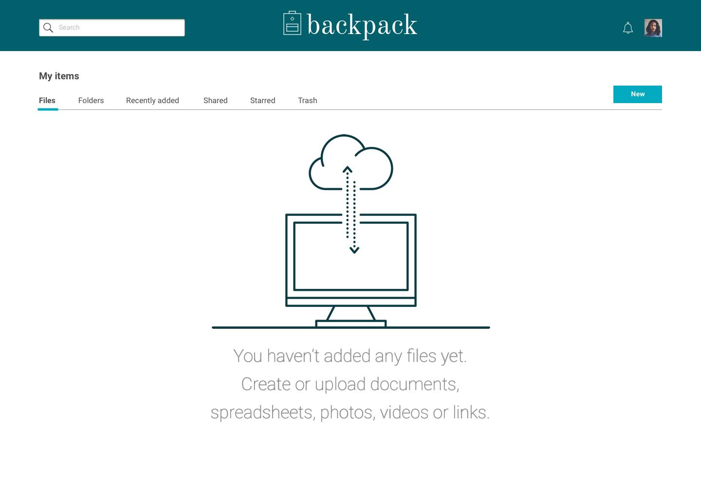
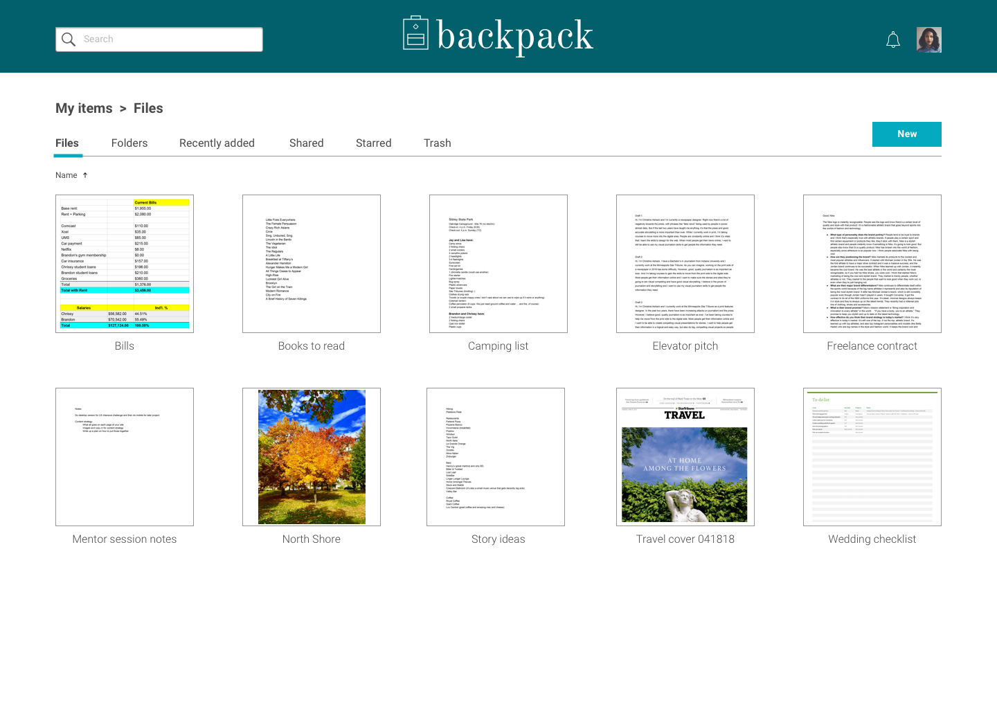
I created a site and mobile app that appealed to everybody, without looking like every other cloud storage and organization site/app. In the research and testing phases, I discovered that there isn’t a product currently on the market that everyone uses or feels loyal to, which told me there’s an opening for Backpack. I designed a site that’s clean and easy to use. It has all the features survey users said they wanted, without so many extra features that it’s overwhelming. The site uses two colors, one primary and one accent. The simple color palette makes it easy for users to find the items I designed to stand out. All users tested in the high fidelity mockup phase commented on the design, with all saying it looked nice, was clean and easy to use.
Process
A client approached the agency with the desire to enter the cloud storage and organization market. I was charged with making all design decisions and producing all needed assets and deliverables. I was also in charge of all research and testing for the product. I had a lead designer overseeing my process and providing any needed feedback.
User Research
For the research phase, I did a user survey to help me find out which products already in the market people are using, which features of these sites they like, which they don’t and what these sites are missing.
Top three sites participants use:
72%
Google Drive
64%
Dropbox
48%
There were a handful of other sites mentioned. A large majority, 84%, said they use one of these either daily or multiple times a week. That tells me this product would be something users would use frequently, possibly everyday depending on the features.
There were four features that users indicated were the most important: Both the ability to organize content into folders, groups, etc., uploading files or folders from a desktop or mobile device, sharing content with other people and creating content like documents and spreadsheets. Only about half stated that saving content from the web was important.
The most important features for users:
88%
Organization
88%
Uploading
76%
Folder
organization
91%
Document
creation
88%
Spreadsheet
creation
Sharing was also important and the majority of people preferred the ability to share via email, but some wanted the option to do email or social media.
Competitive Analysis
For a competitive analysis, I looked at Google Drive, Dropbox and Pinterest.
Google Drive is probably the most well-known and it also has the most features. It allows users the ability to upload pretty much any type of file, organize files into folders, share with others and create a variety of new content. It also connects to Gmail accounts and other Google products. It can be difficult to find items within Drive.
Dropbox is more limited than Google Drive. While Dropbox is nice for storing items, it’s pretty limited in what users can do. Users can’t create any content within the site, so they can only upload content. There can also be some issues with trying to find items.
Pinterest is completely different from the other two sites. While Drive and Dropbox are storage sites for anything from files and spreadsheets to photos and videos, Pinterest is intended to be a moodboard for users. It’s an incredibly useful site for saving items a user finds online and wants to keep, without making them bookmark a million webpages. It also is great for users looking for inspiration for anything from wedding ideas to recipes and beyond. It also allows for sharing of pins and boards with other users. However, it’s not a place for documents, spreadsheets or anything of that nature. Users can’t store documents and they can’t create them. This is a very specific site.
User Personas
1
Name: Jane
Role: Working professional
Demo: 25-30, journalist/communications, Midwest and female
Bio: She is a working professional that needs to organize and store both work and personal items. She likes organization and wants to be able to quickly and easily organize all her content.
Motivations: She uses Dropbox and/or Google Drive daily. She uses it for both business and professional reasons. Organizing content is important to her and she likes to use folders to do so.
Goals: She wants a clean, simple app that she can both upload and create content. She wants to store work and personal content.
Frustrations: Too many options or too few options. Not really an in-between. She wants something with good organizational options and some content creation, but she doesn’t need it to be everything.

2
Name: Brian
Role: Graduate student
Demo: 22-28, communications, Midwest and male
Bio: He is a graduate student that needs to organize and store school work and personal work. He needs to be able to find school work easily and organize everything to separate school and personal.
Motivations: He uses Google Drive daily. Folders make it easy for him to organize everything.
Goals: He wants a clean app to make it easy for him to create and organize everything.
Frustrations: Dropbox doesn't do enough and Google Drive has too much going on. He needs to create documents and spreadsheets and also keep everything organized.

3
Name: Rachel
Role: Working professional and part-time student
Demo: 25-30, journalism, East Coast and female
Bio: She is a working professional and a part-time graduate student that needs to organize and store school work, professional work and personal work. She needs to be able to find and organize all content for every part of her life.
Motivations: She uses Google Drive daily. Folders are the easiest way for her to keep everything separate and organized.
Goals: She wants an app she can use everywhere and is easy to use. She needs to keep everything in its place for easy access.
Frustrations: Dropbox doesn't do enough and Google Drive has too much going on. She creates documents and spreadsheets and keeps work, personal and school work in one place.
User stories
I created user stories for new and returning users.
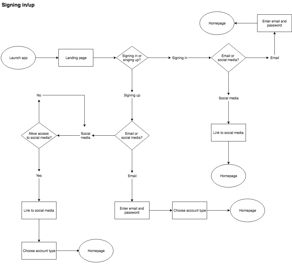
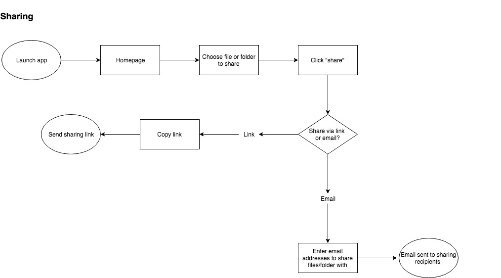
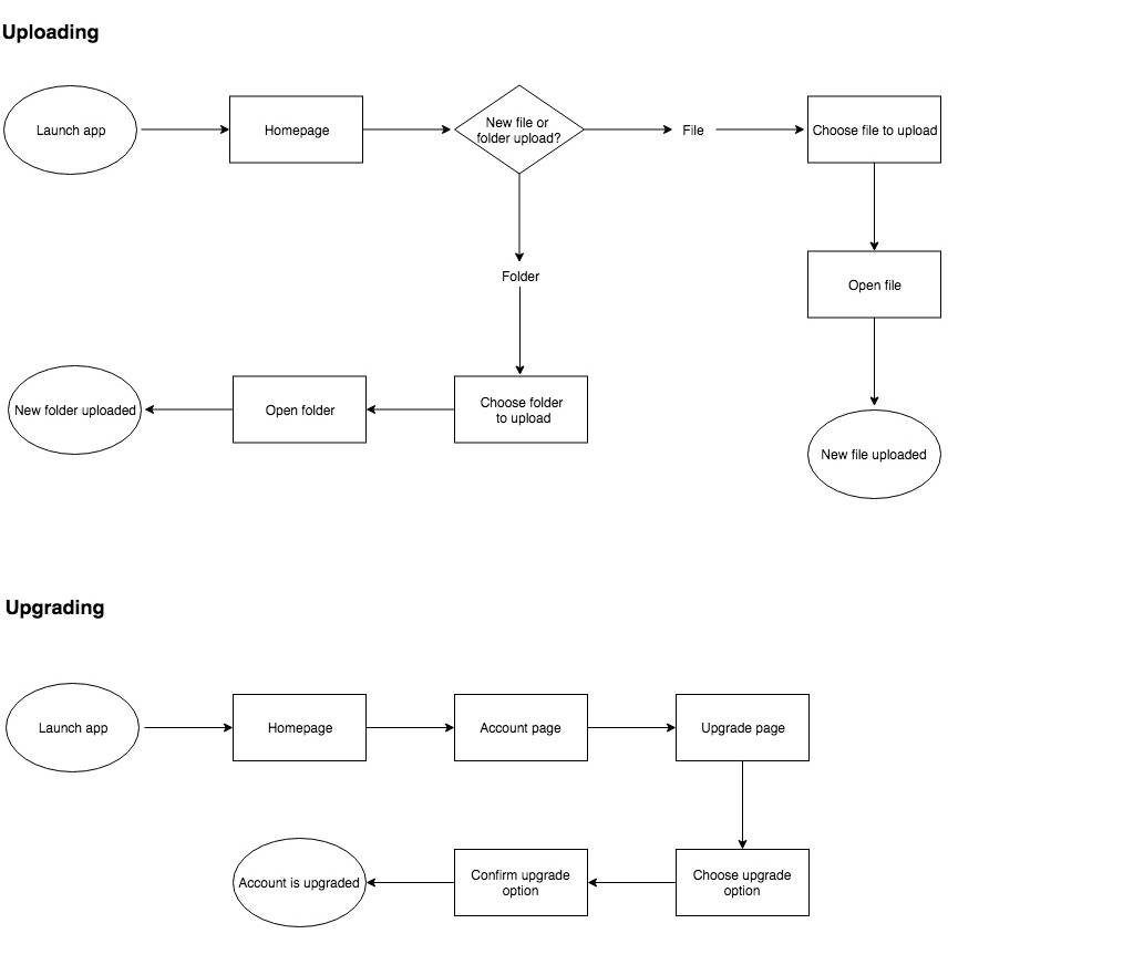
User Flows
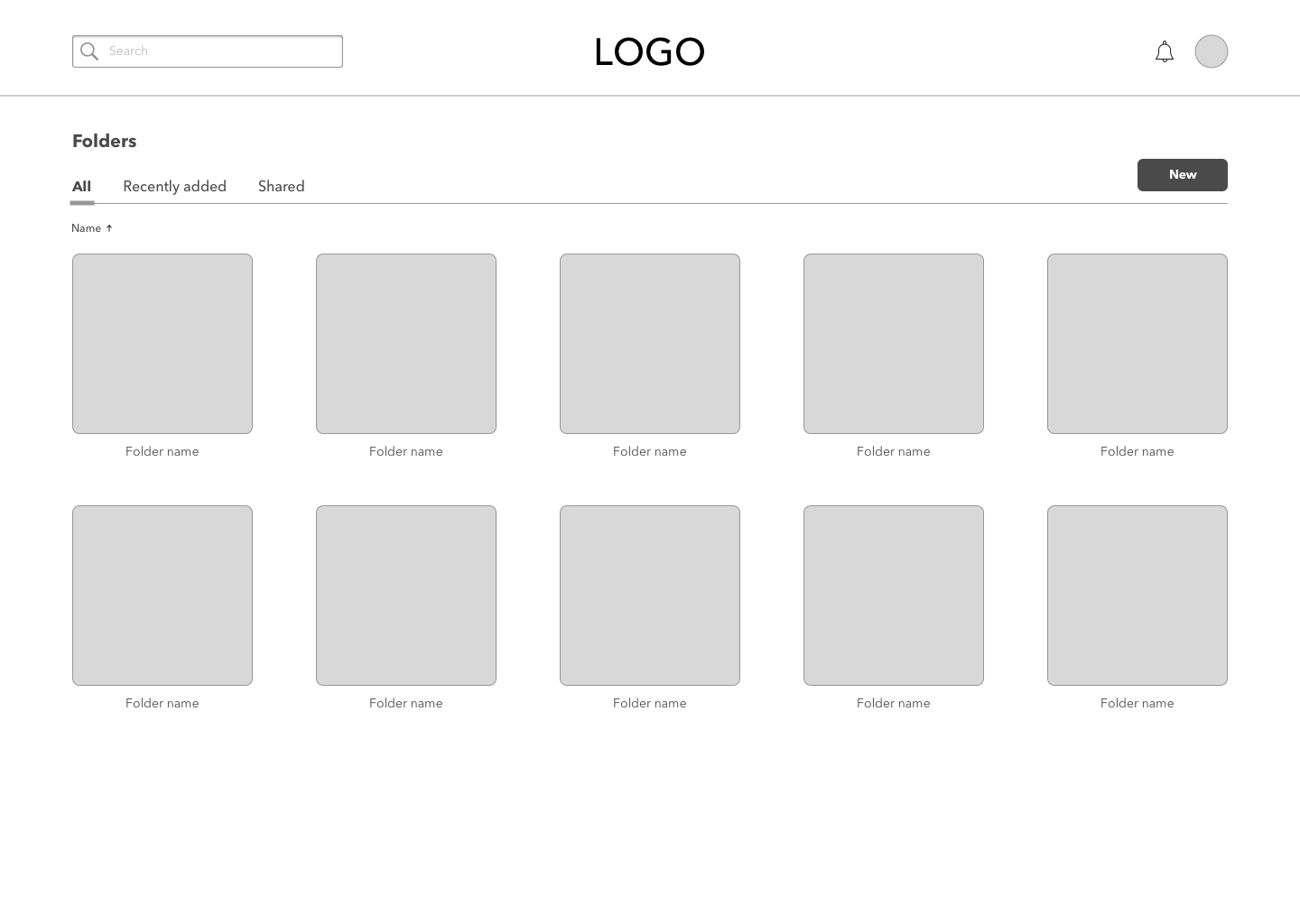
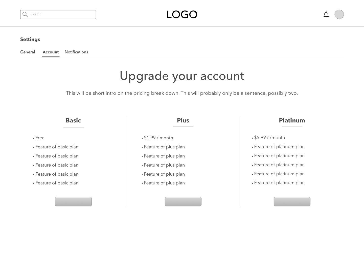
Wireframes & Mockups
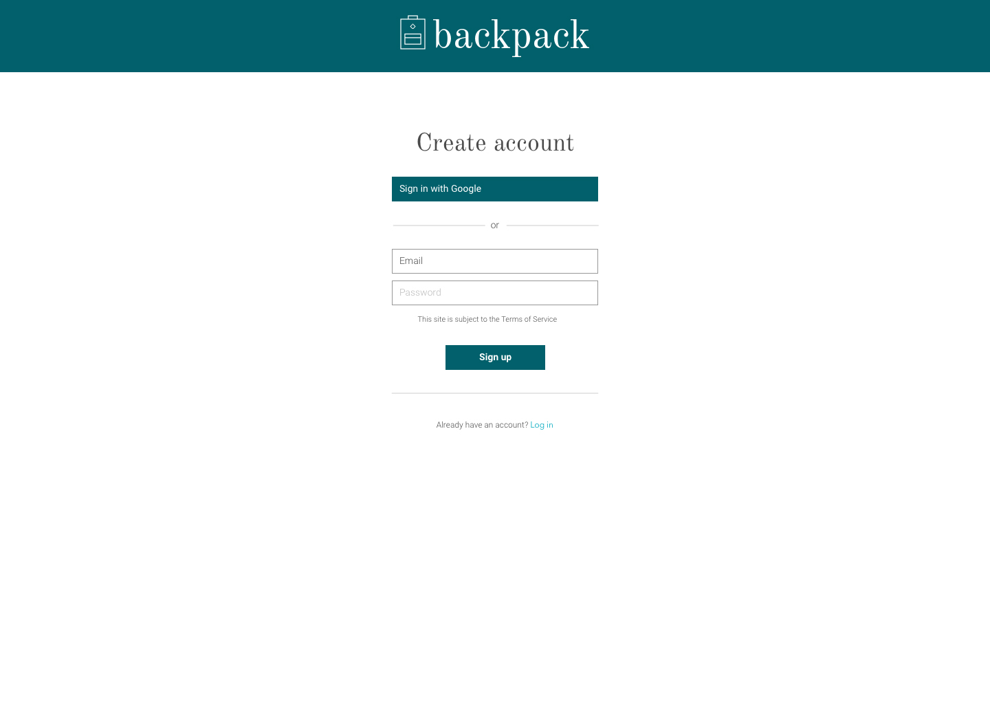
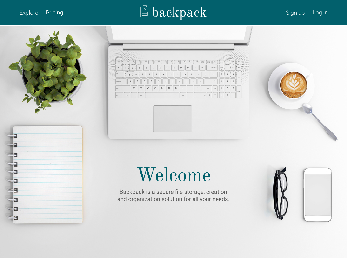
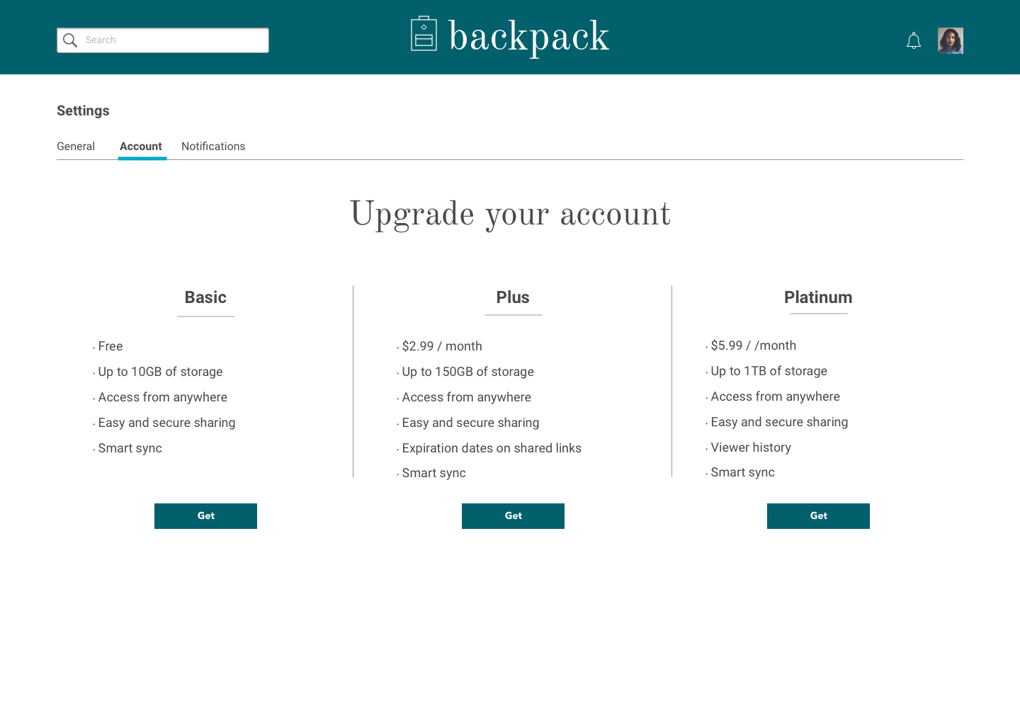
After designing the wireframes and doing an initial round of user testing with those, I went on to design mockups of the site. This included pages for a landing page, a dashboard (empty and full), sign in/sign up, forgotten password, files, folders, settings and upgrades.
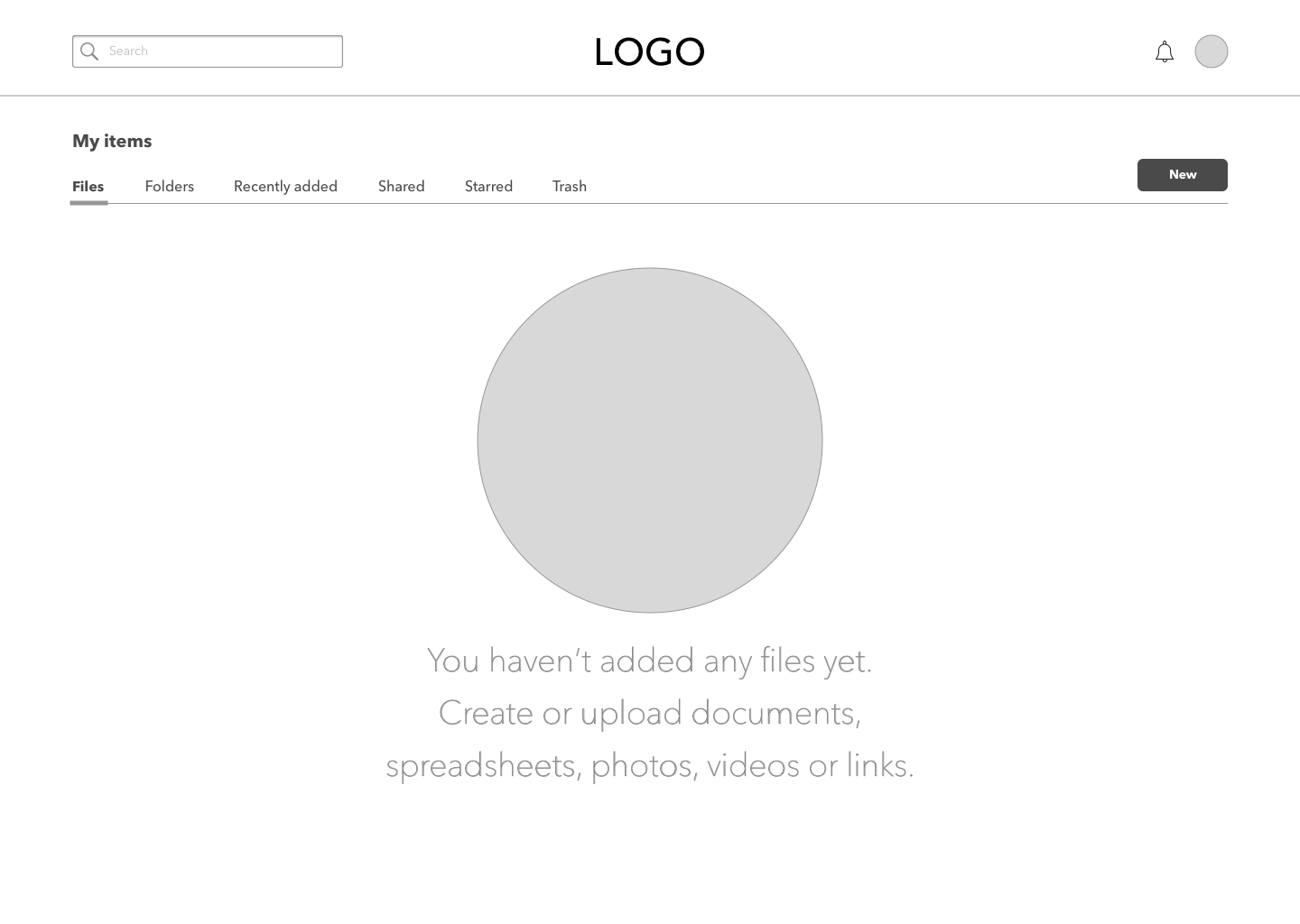
I made some changes to the mockups after a preference test. The homepage went from an illustration to a photo and the design of the folders changed.
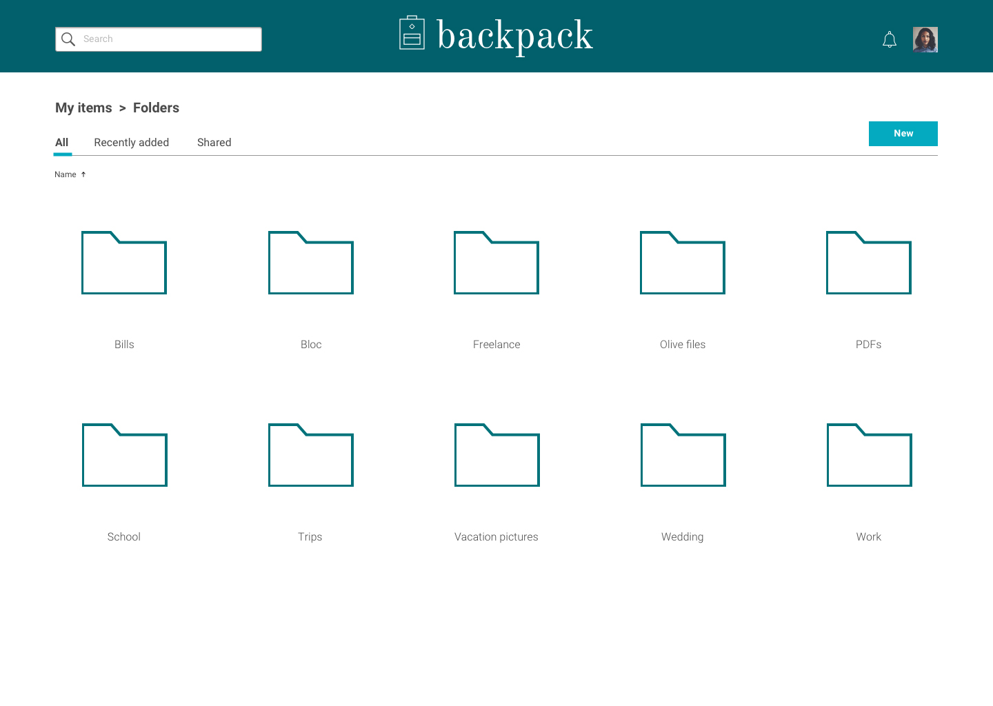
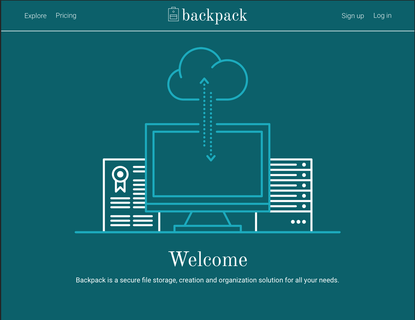
Branding
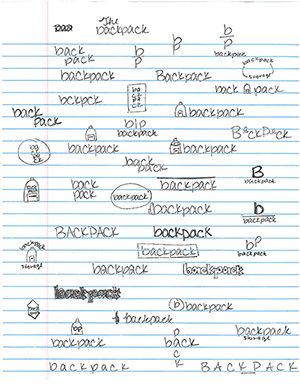
In addition to the design of the site, I did the logo design and branding styleguide for Backpack. I first did sketches of potential logos. Once I had all my ideas on paper, I picked one or two I thought could work and started designing them on the computer. Once I decided on the general direction for the logo, I started looking at potential typefaces. I went tried iterations with six different typefaces before deciding against all the typefaces I was focusing on and deciding on Old Standard TT.
I wanted the type and color to be elegant and refined without feeling stuffy. I went with a serif because I felt it had a more scholarly and professional feeling than a sans serif. I decided to use a dark, gem-colored green to pair with the typeface. I wanted something that was gender-neutral but elegant.
User Testing
I has three participants for each round of user testing. I tested three specific tasks each time: signing in/signing up, adding a new piece of content and organizing a piece of content. In the first round of testing, all three users successfully signed up without any problems. One user had an issue with adding a piece of content because she tried to drag and drop a piece of content from her desktop into the prototype (her test was done remotely). One user also had a little bit of trouble finding the correct way to organize a piece of content.
In the second round of user testing, I tested the same three tasks. All three users flowed through each task as the site was designed to do with no incidents at all. All remarked that the site was clean and really easy to use.
Conclusion
After all the designing and testing was done, the site has proven to be clean and easy to use. That’s exactly the result I was going for in the design and branding of the product. I was surprised all users flowed through the usability testing without the site needing any real or extensive changes. If I had more time, I probably would add more features, including a button to be able to save items from websites to Backpack. I would also try to have the app link to a user’s phone so they can upload items from their phone to the app without having to open the app.